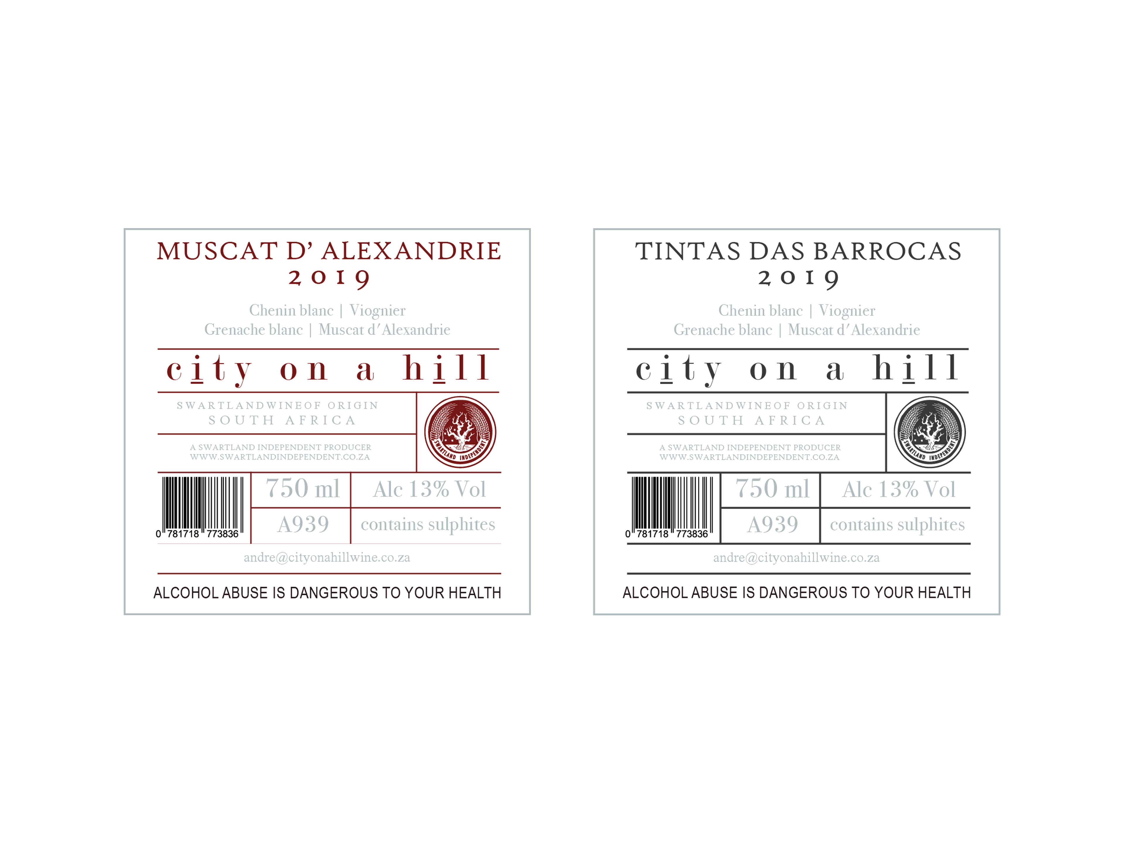
Original City on a Hill Wine Labels
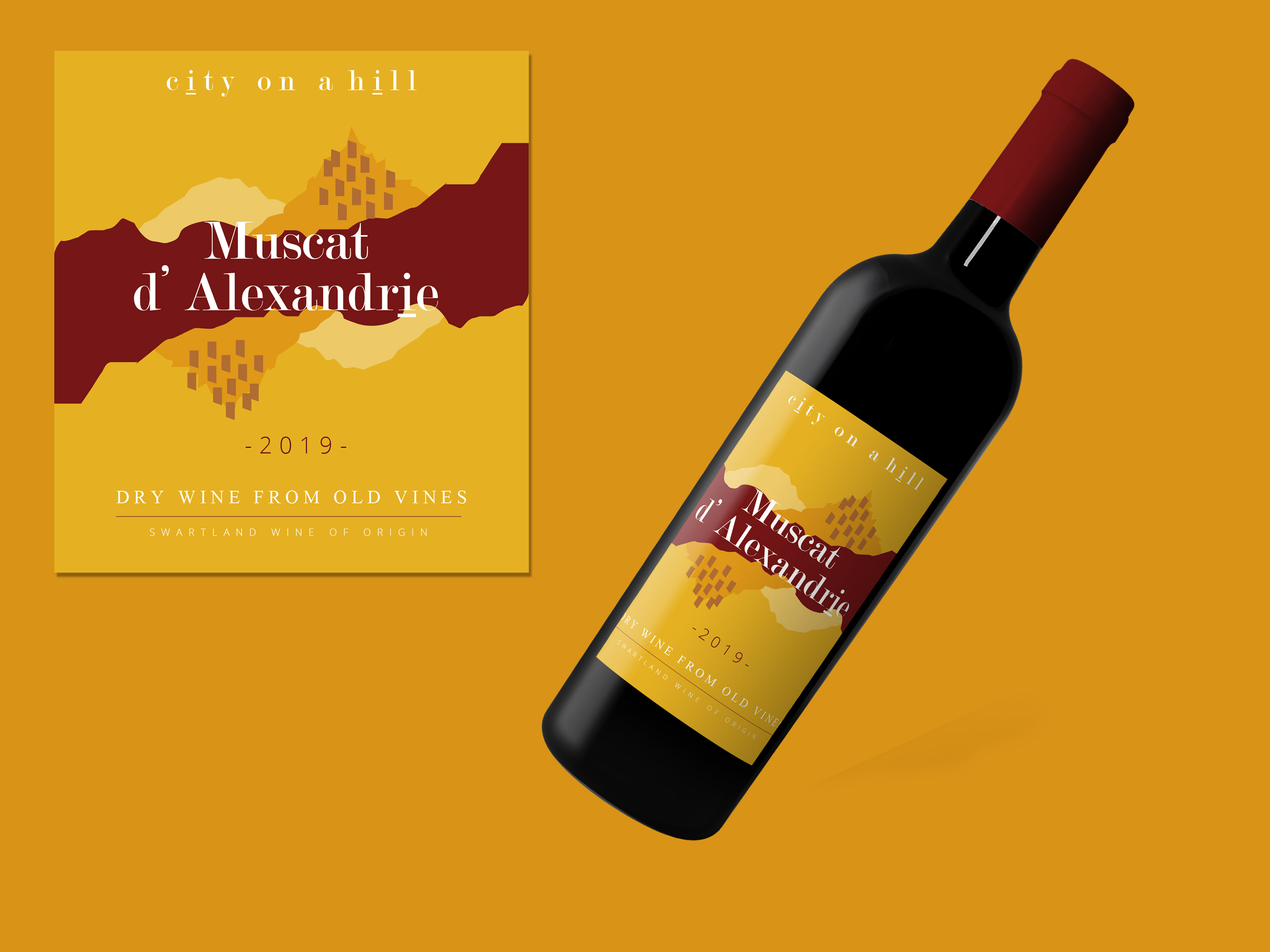
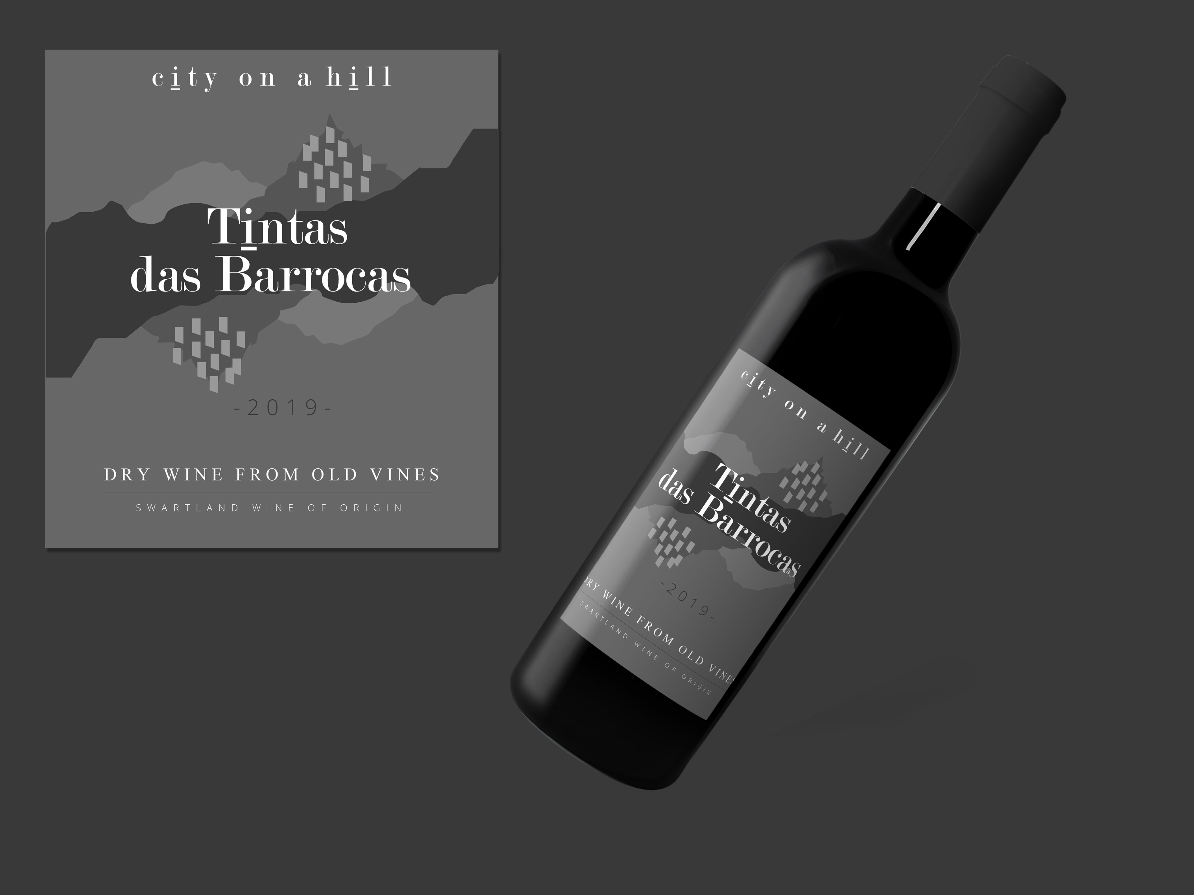
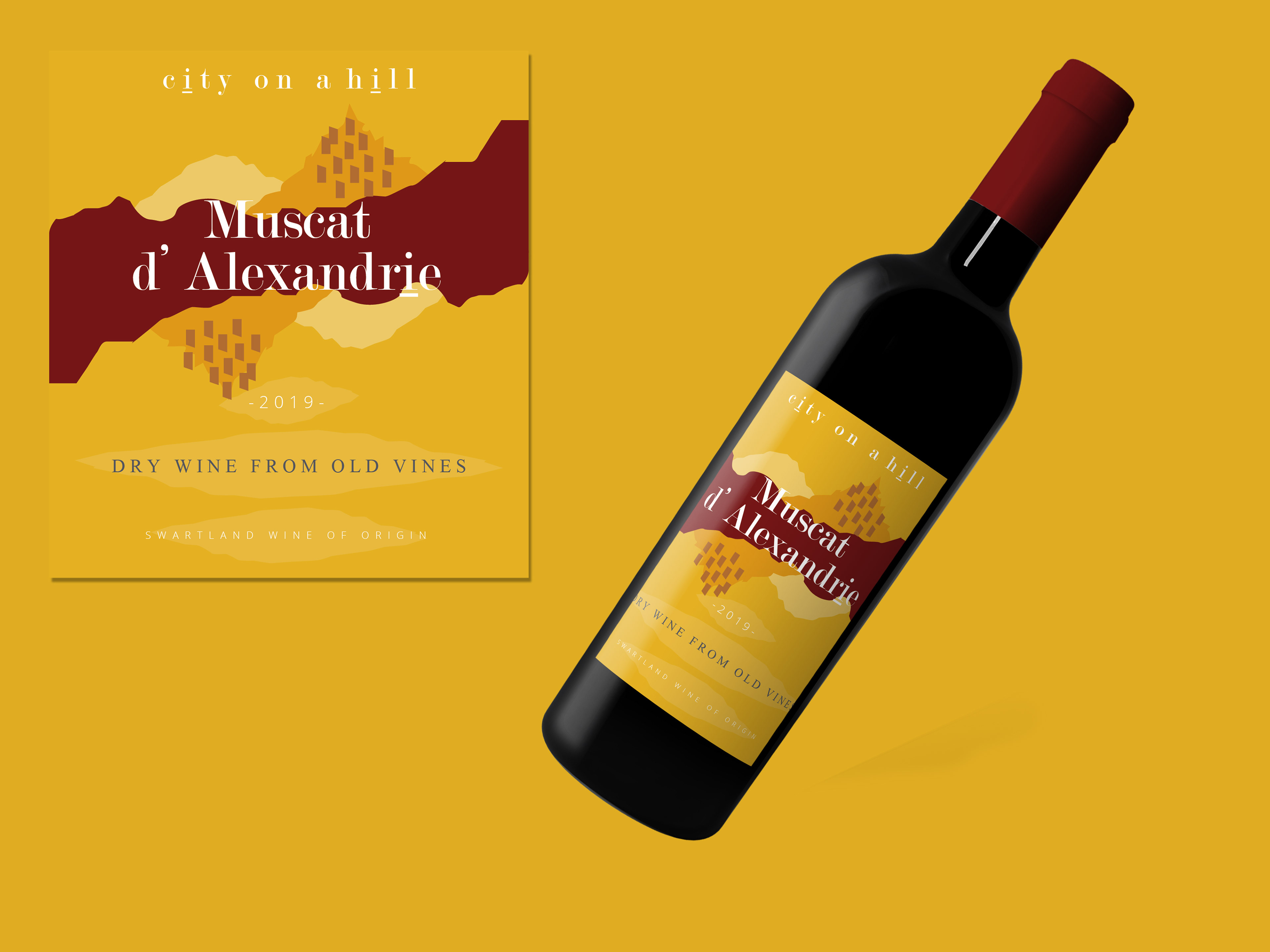
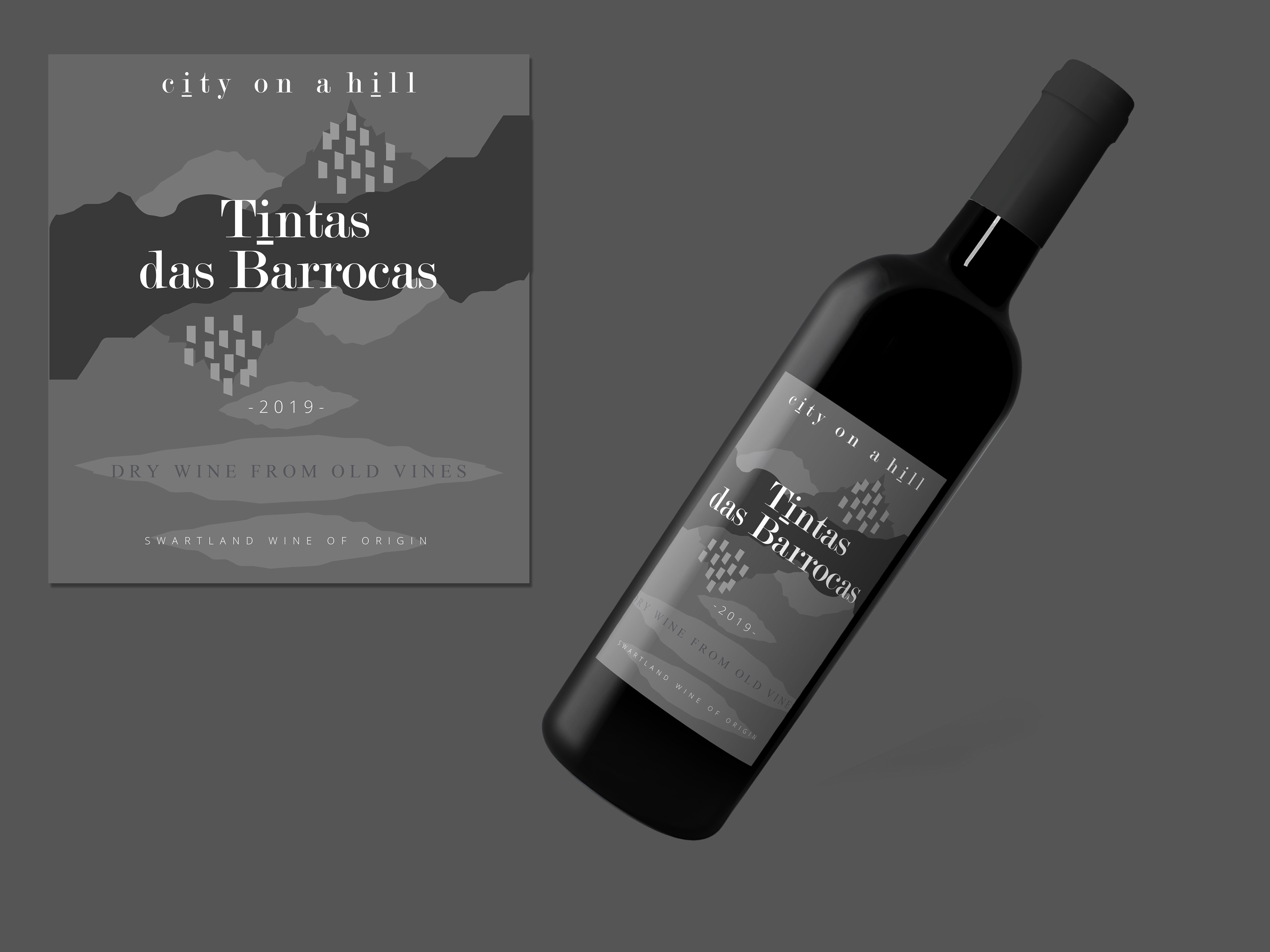
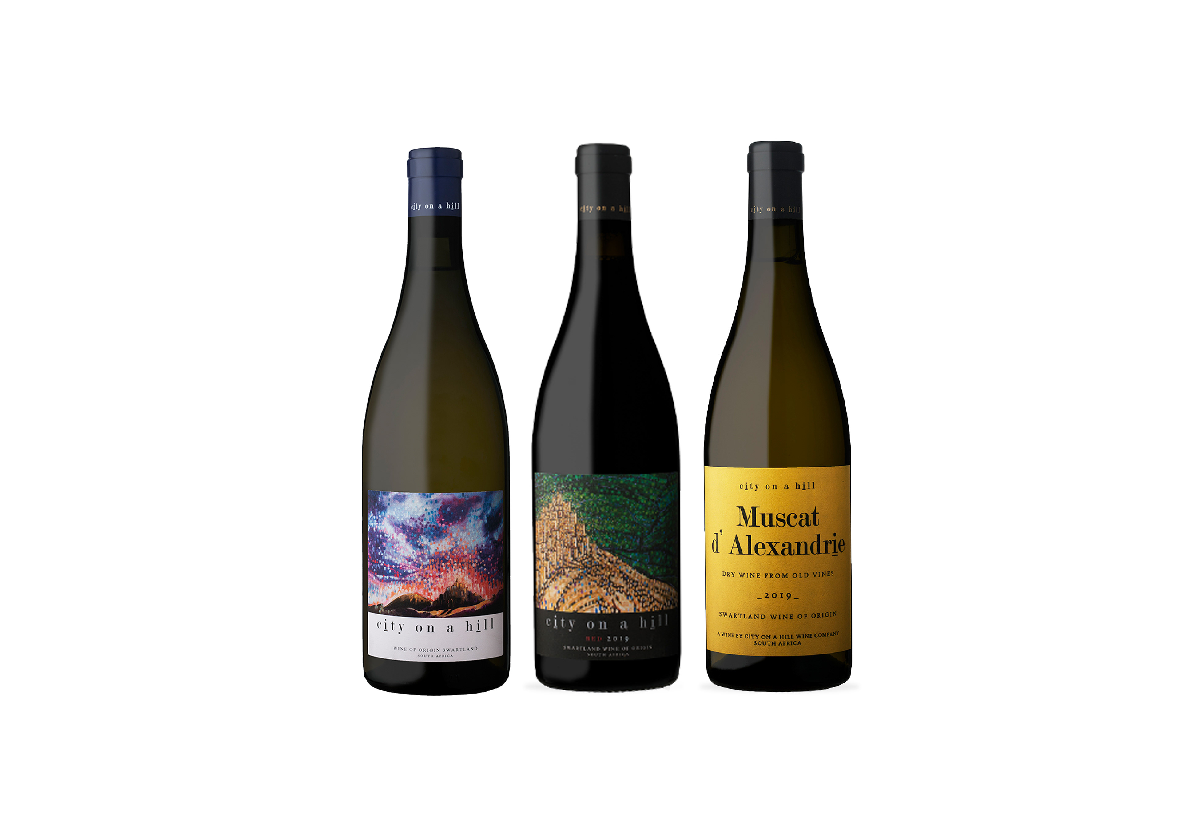
City on a Hill is a wine company based in the Swartland area, South Africa.
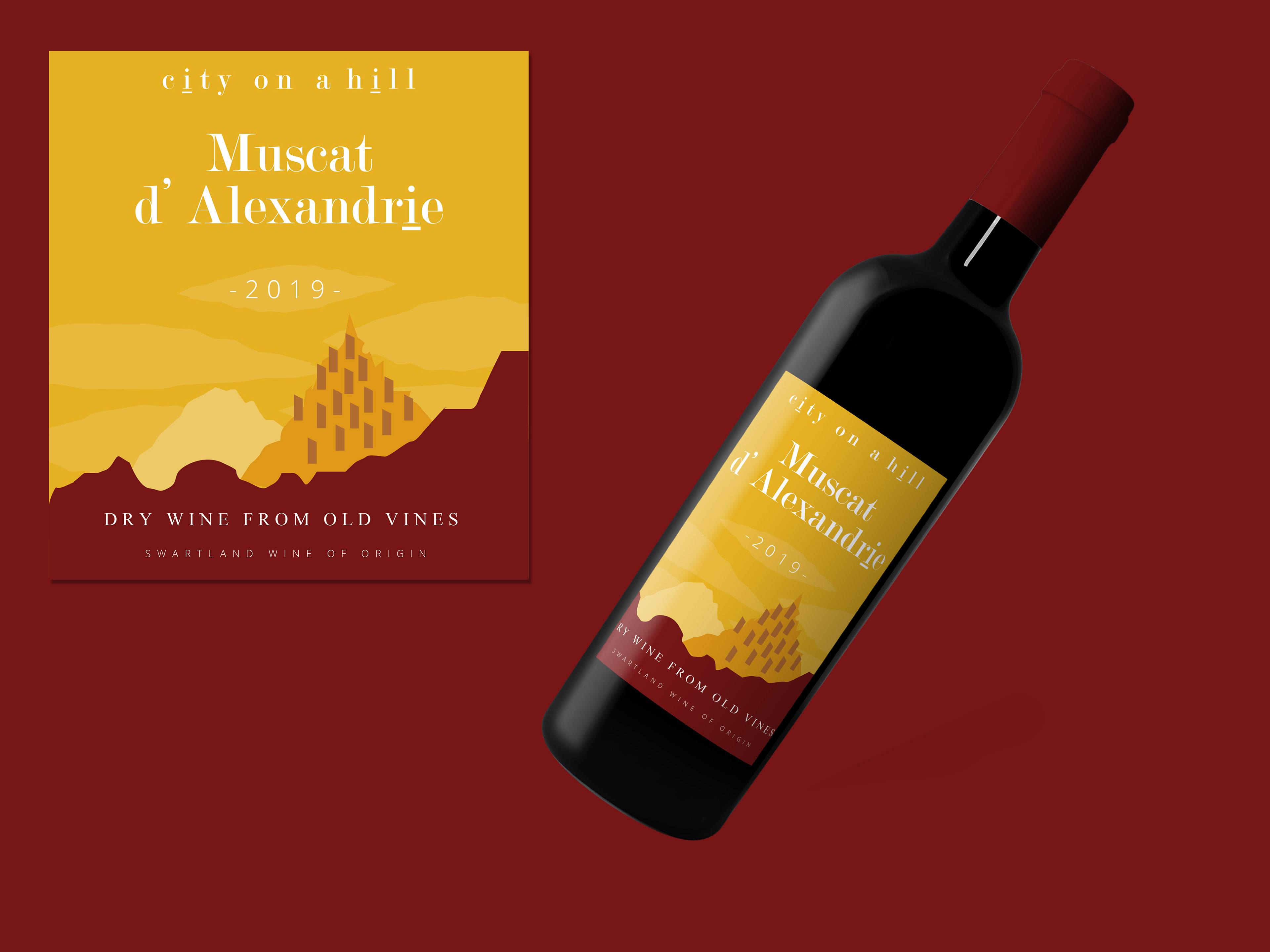
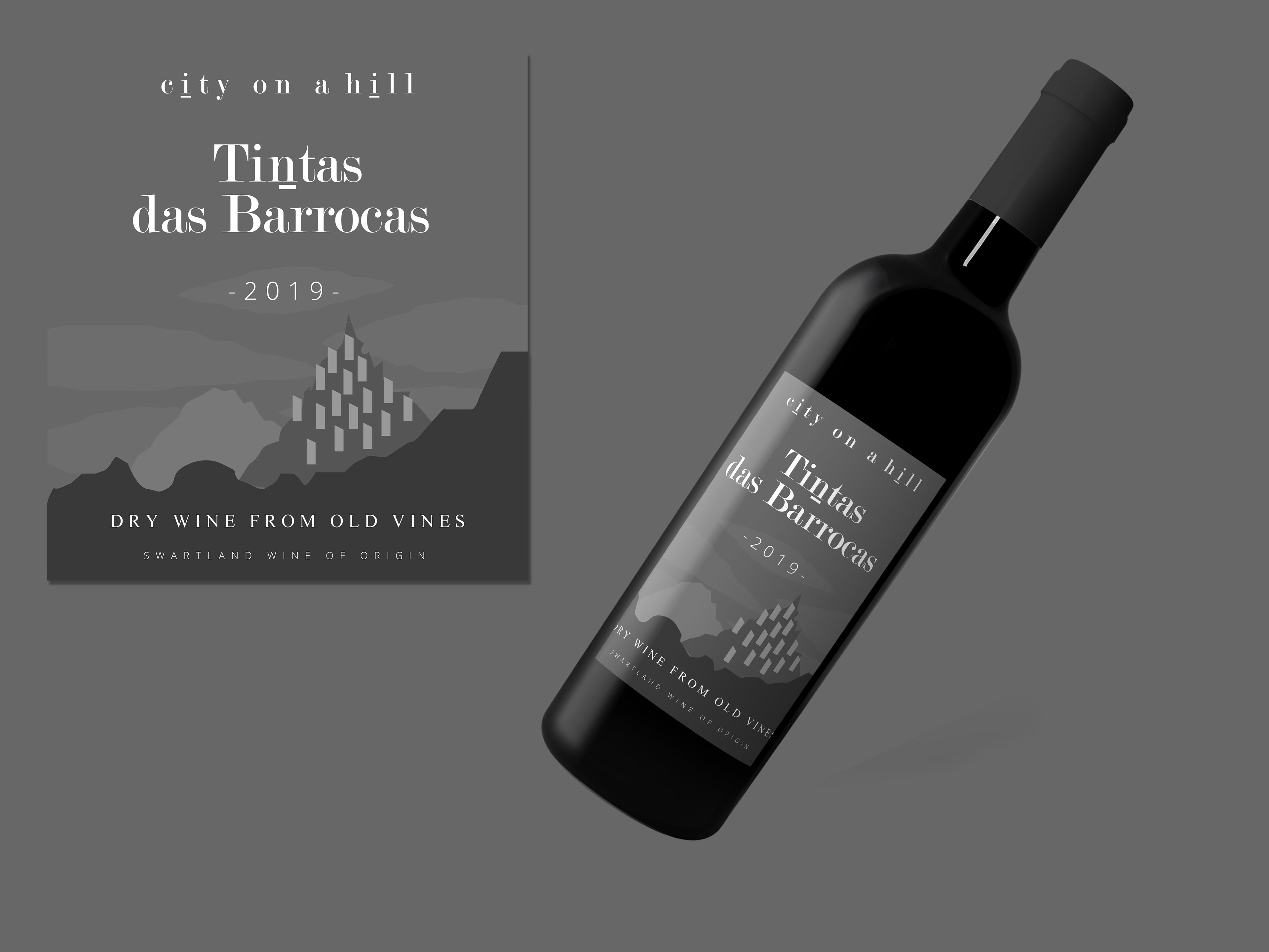
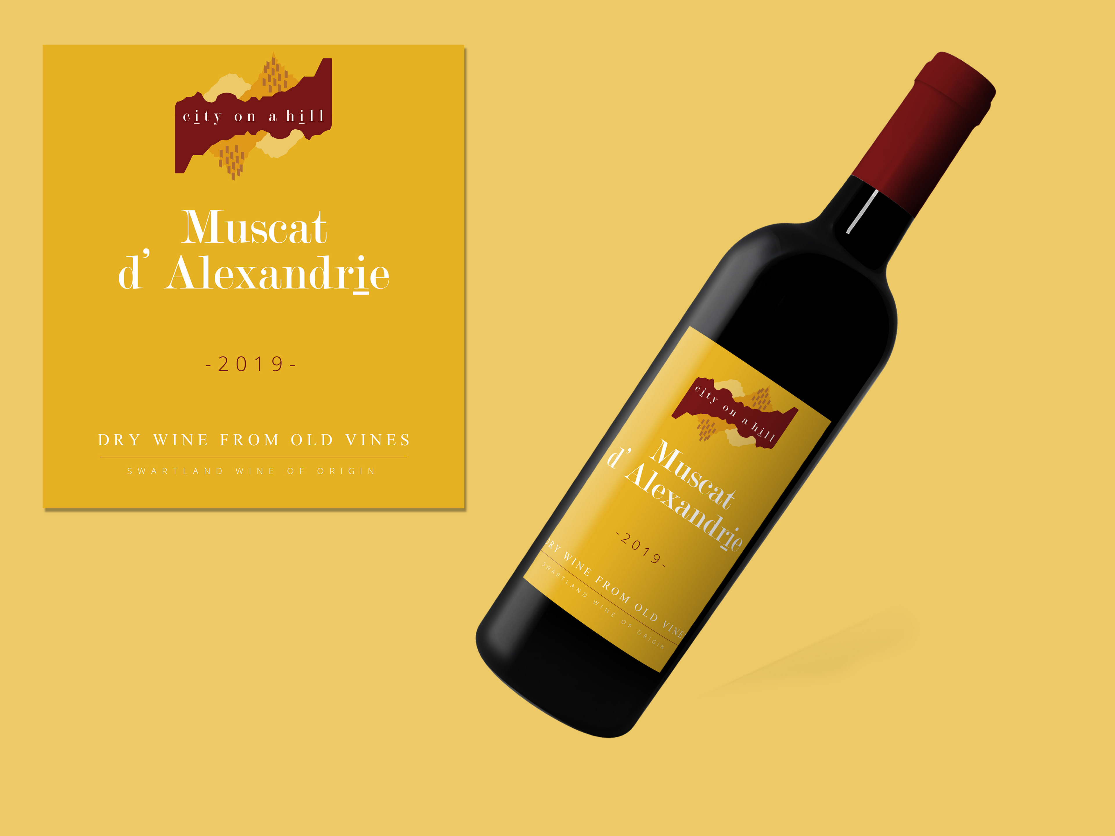
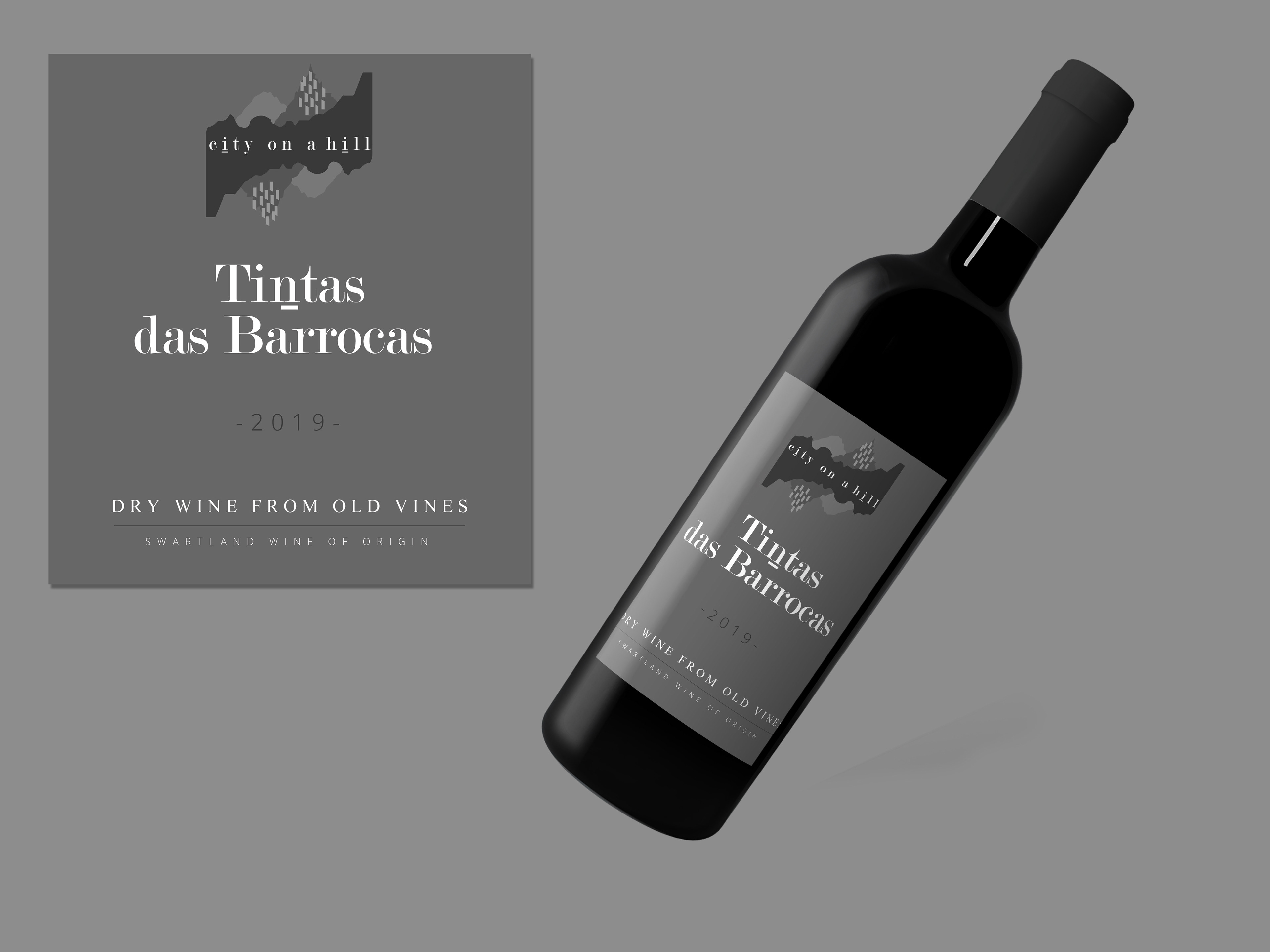
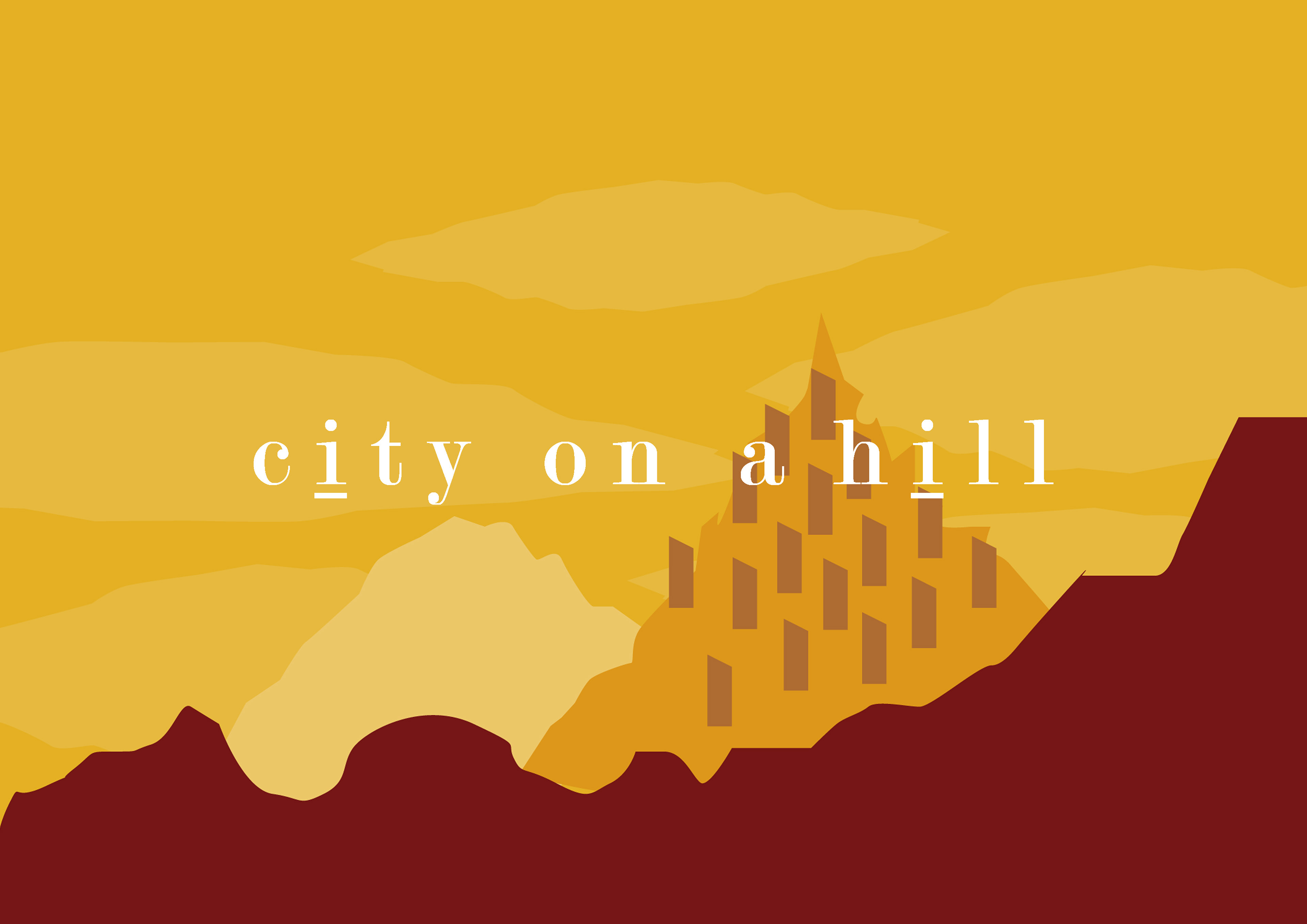
The client asked me to design new labels for two of the cellar's most significant blends. The cellar originally commissioned a family friend to hand paint the scene of a city on a hill, in keeping with the name. I chose to do a more simplistic/Abstract illustration of the city on the hill so it becomes more of a stylized graphic rather than a painted picture. I drew inspiration from this back story that had sentimental meaning and illustrated the painting version to modernise the brand but not stray from the original essence.
The blends each comprise of the same varietals, but in varying ratios. It seemed fitting to highlight their similarities through matching design components, while highlighting the significant differences that ratios can make, through the use of colour.