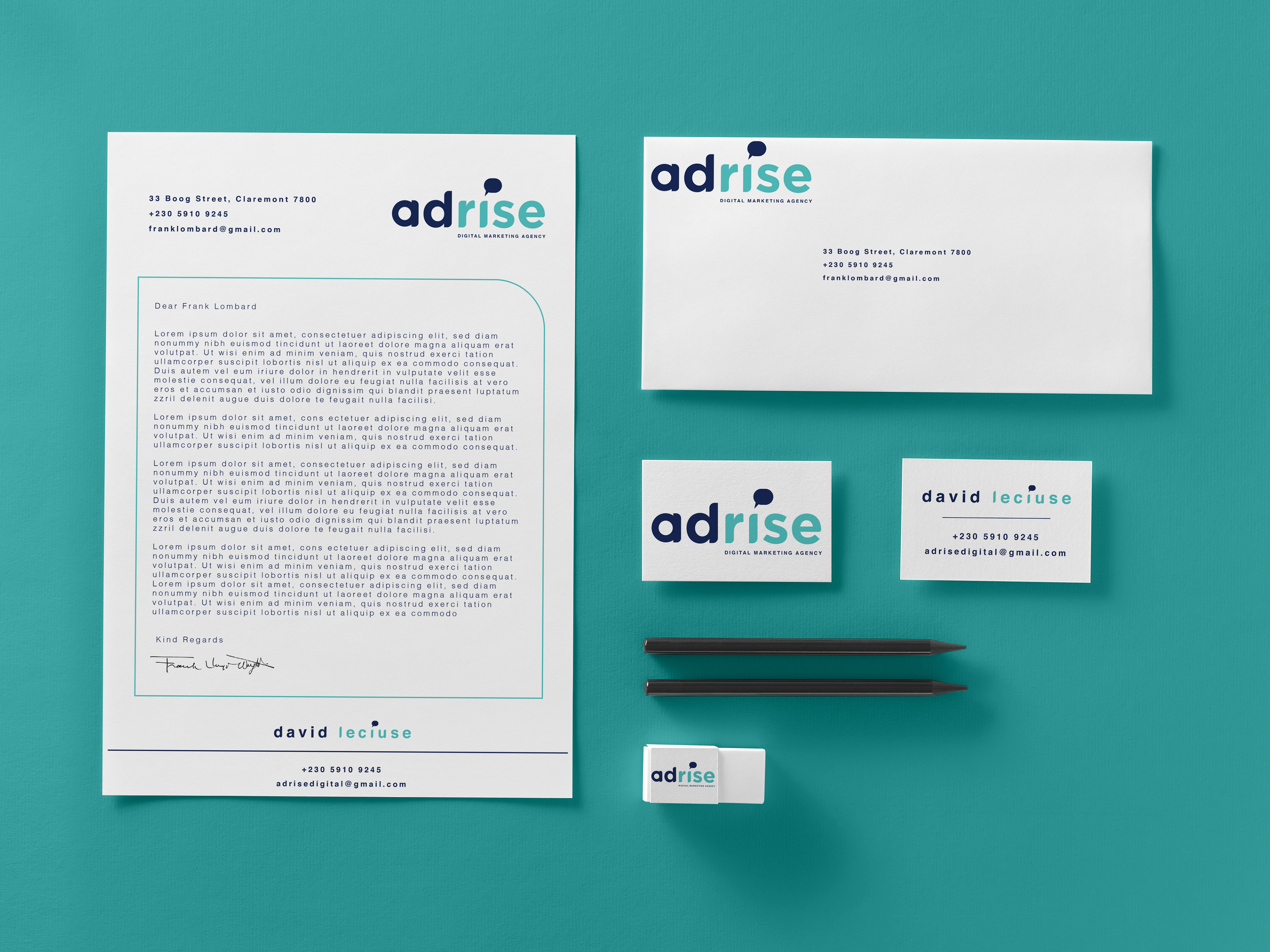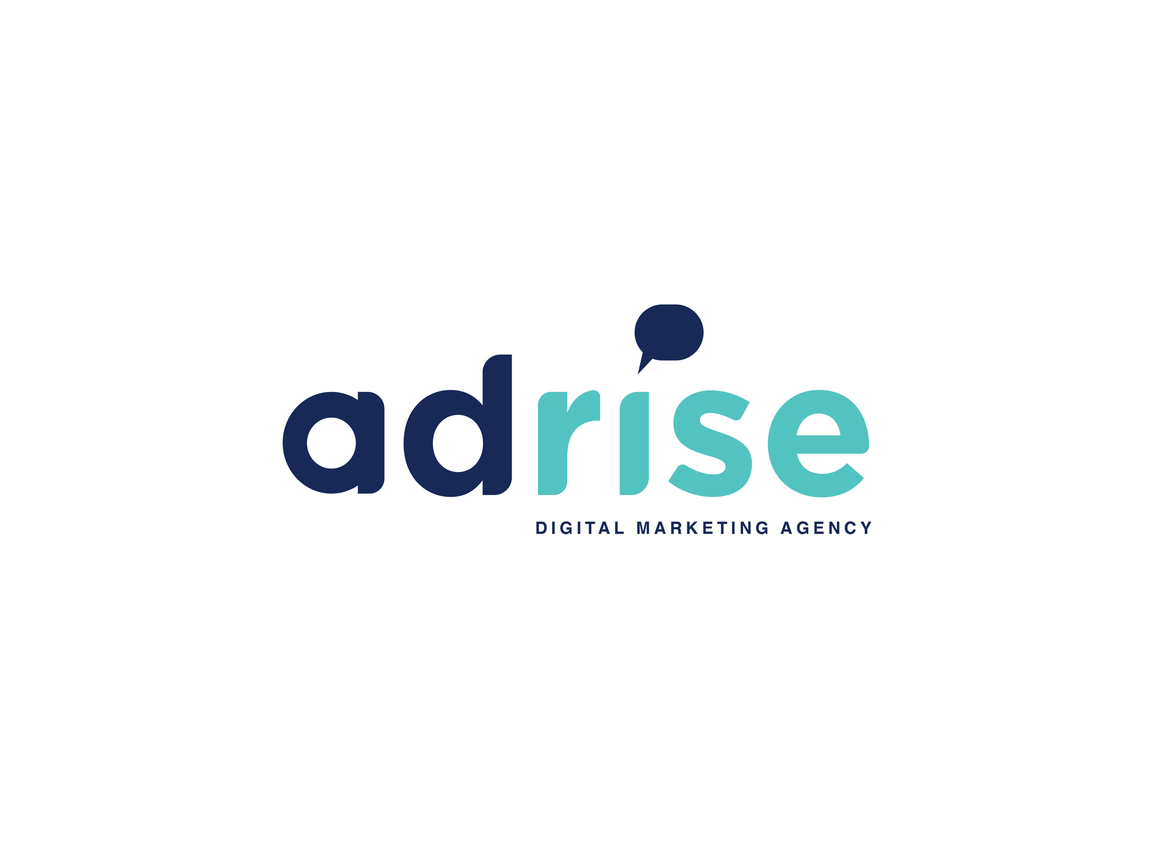
Adrise is a new Digital Marketing agency based in Cape Town. Being a new company, they were looking to create a distinctive corporate identity for them to move forward with, beyond their initial company inception.
For this project I took the Name 'Adrise' and separated it into two components: AD and Rise. This allowed me to formulate ideas based on both the individual attributes of the separated words, and the meaningful combination as one word: AD being the shortened version of advertisement and the word RISE in this case refers to an increase or growth. Combined; the two words refer to, them growing their clients online presence through apt, clear and thought-provoking online marketing.
I translated the literal meaning of rise and inclining or "going up" into a visual representation (such as wings and stairs) when workshopping the logomark.
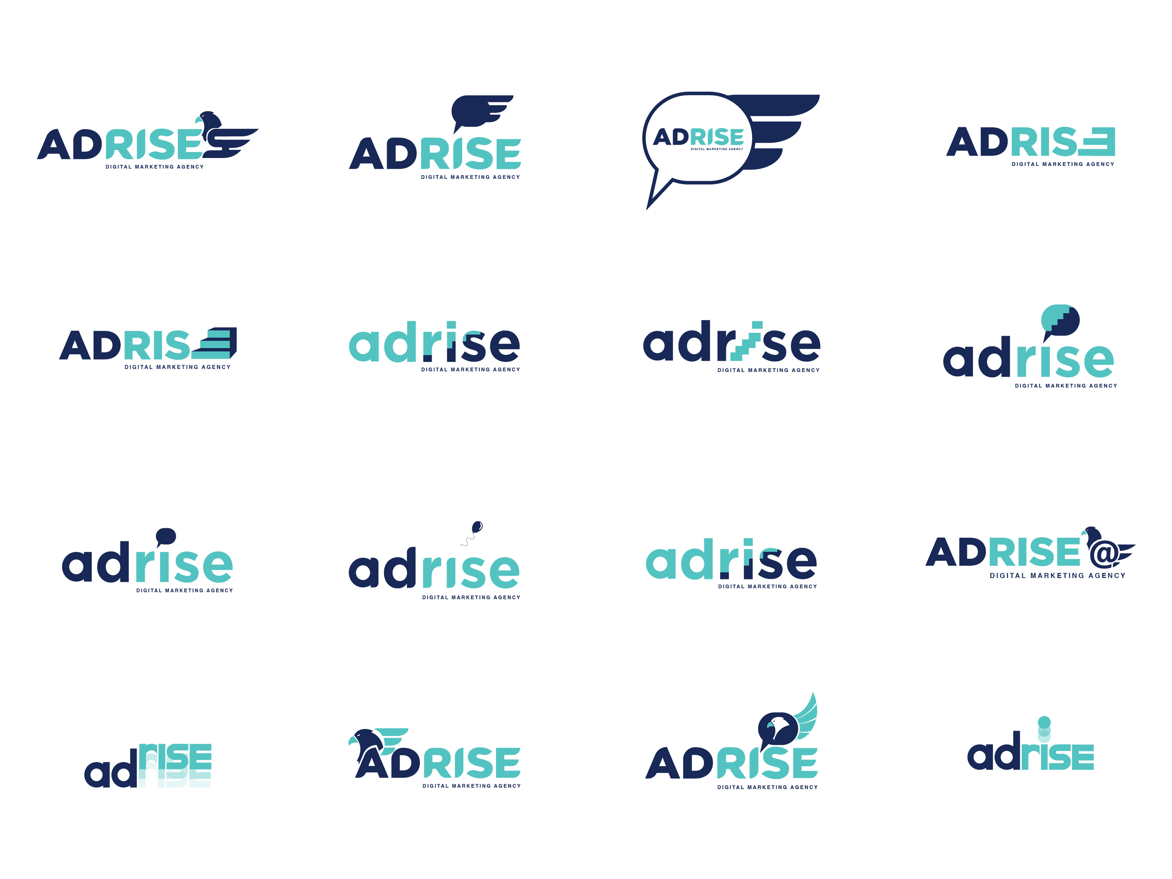
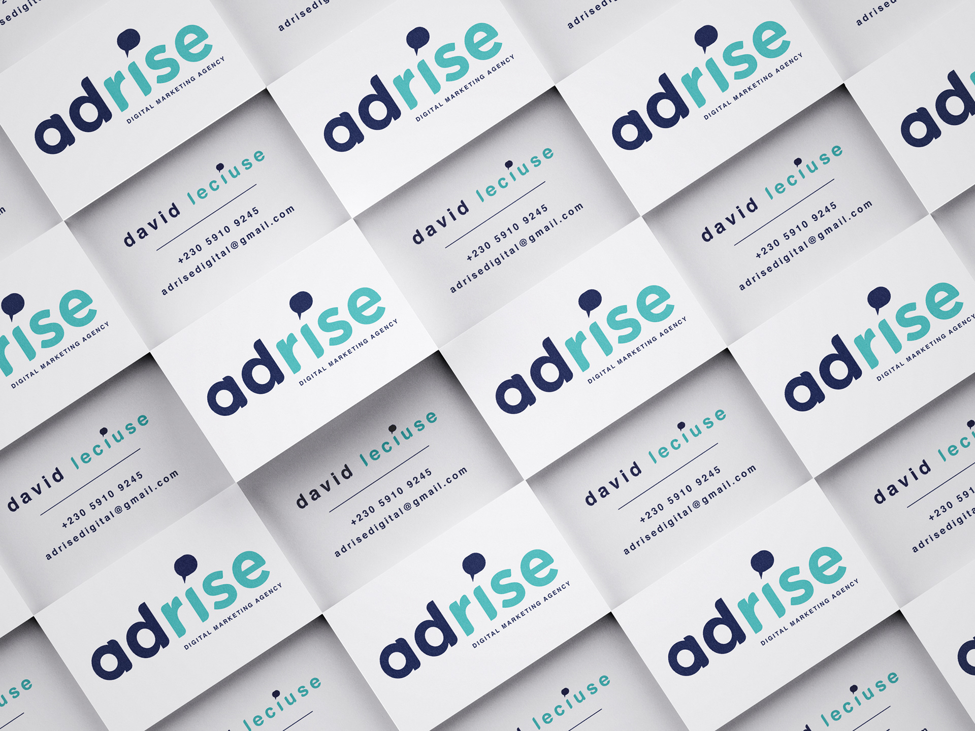
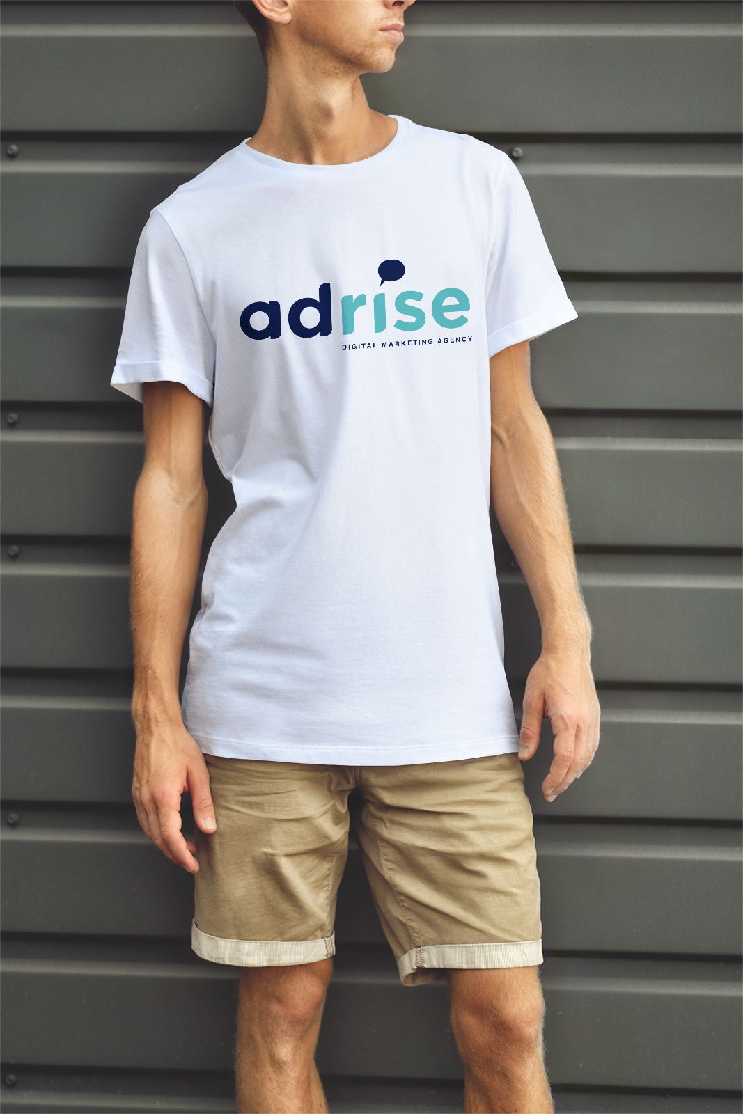
I decided a simple two swatch color pallet would work best as it strengthens the idea of two thoughts combined to formulate one idea.