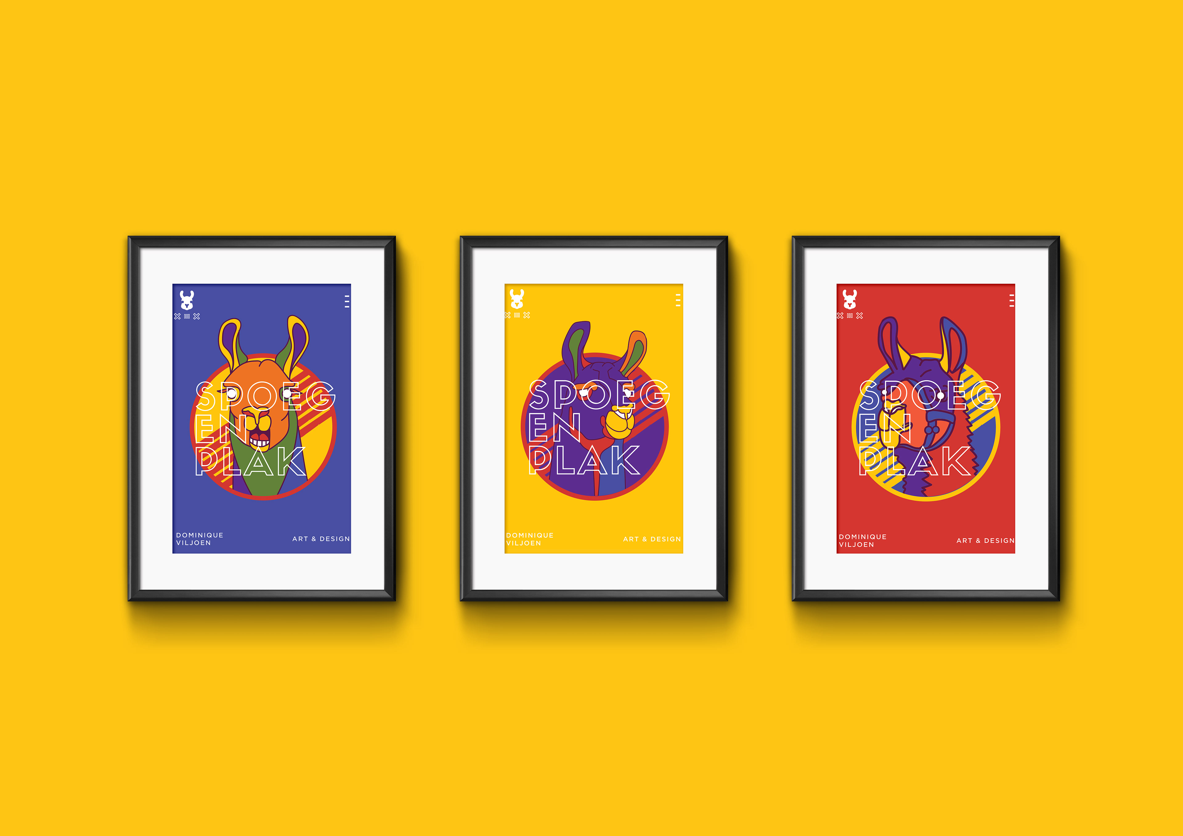
Spoeg en Plak is a quintessential design project that every graphic designer has done at some point in their career...a "personal" branding project in which they disguise themselves under a pseudo "company" name in the hopes of seeming (or feeling) more legit. Spoeg en Plak was mine.
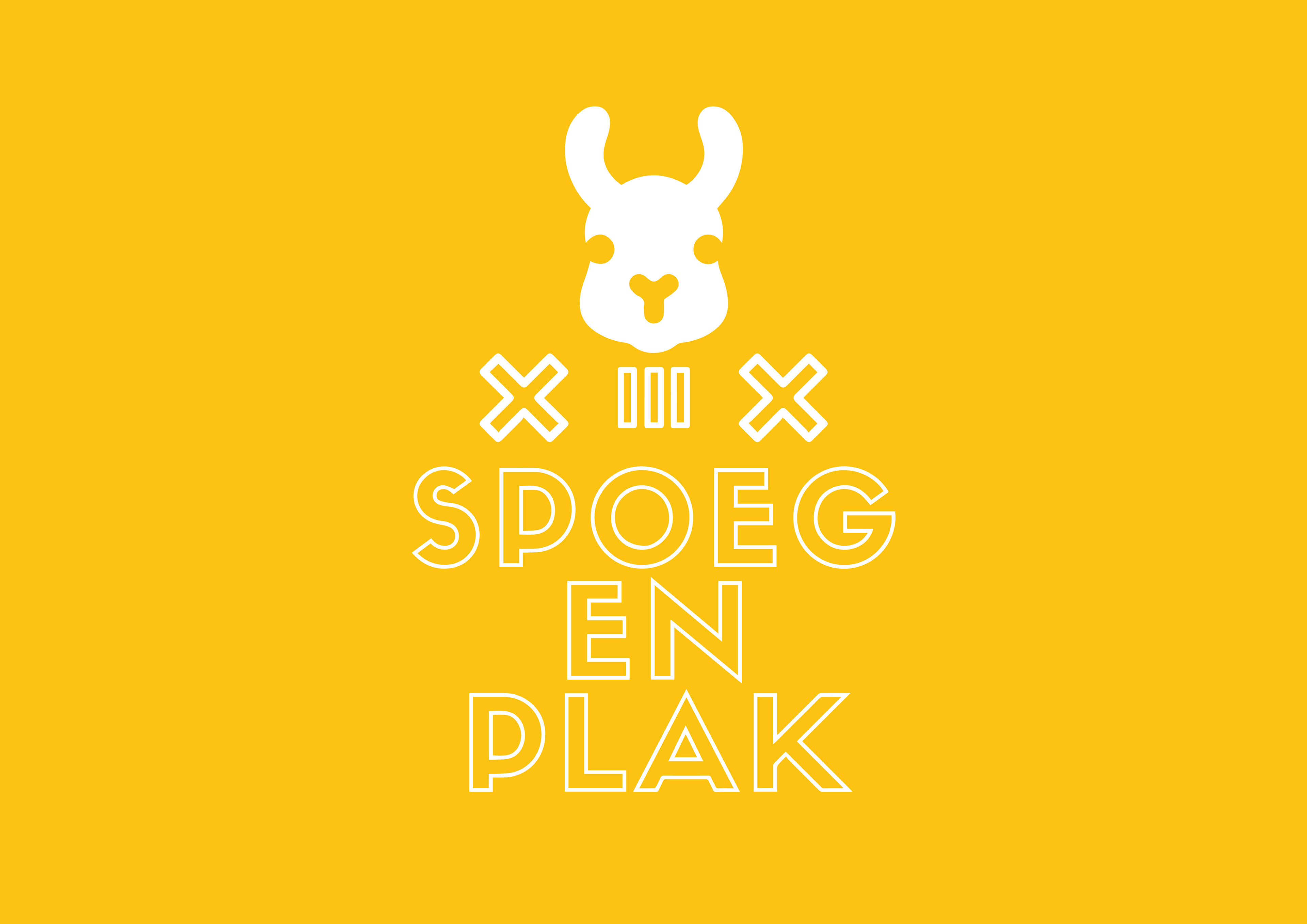
The name Spoeg en Plak originates from way back when, from my days as a tiny creative with big dreams.
Directly translated to English, 'Spoeg en Plak' means 'Spit and paste'- an accurate depiction of the simplicity of using whatever I could find as a youngster to fuel my creative pursuits.
"Spoeg en Plak" is an umbrella term for "arts and crafts", which by all means is the genesis of my creative career: endless hours with bits of magazines, old curtain material and an obsession with colours.
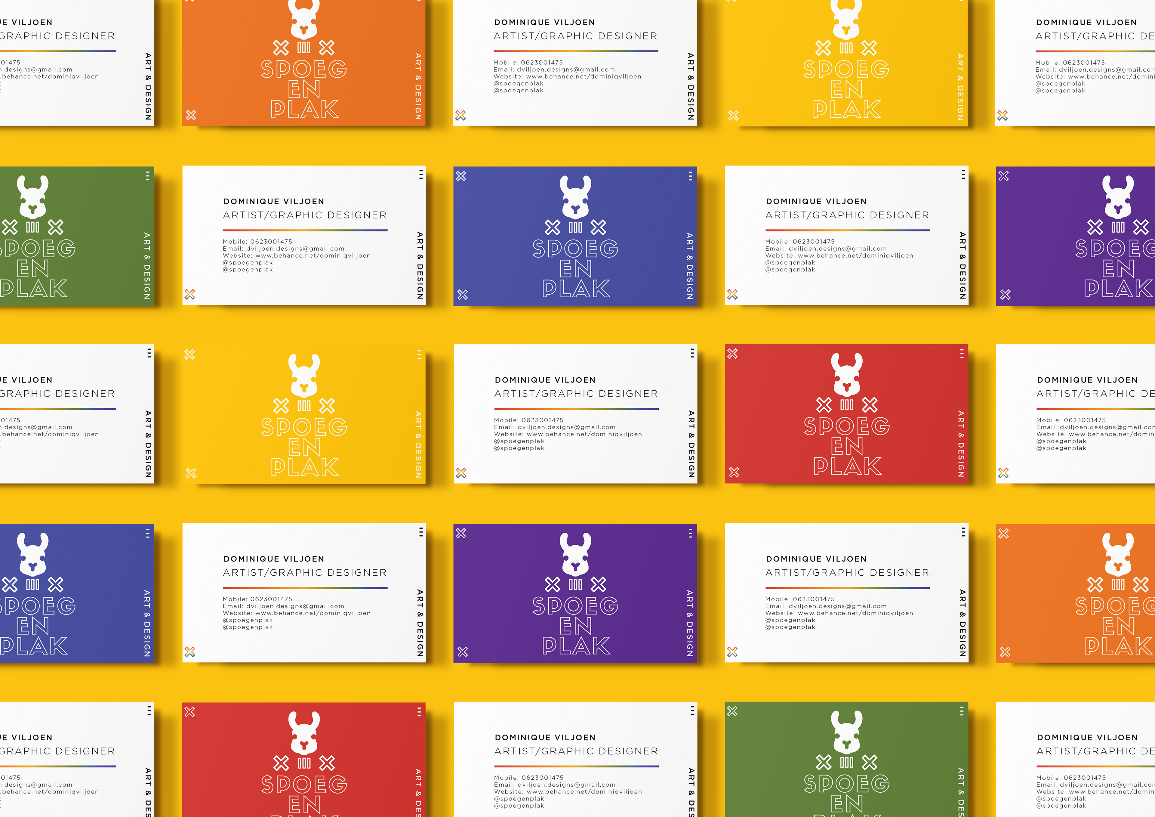
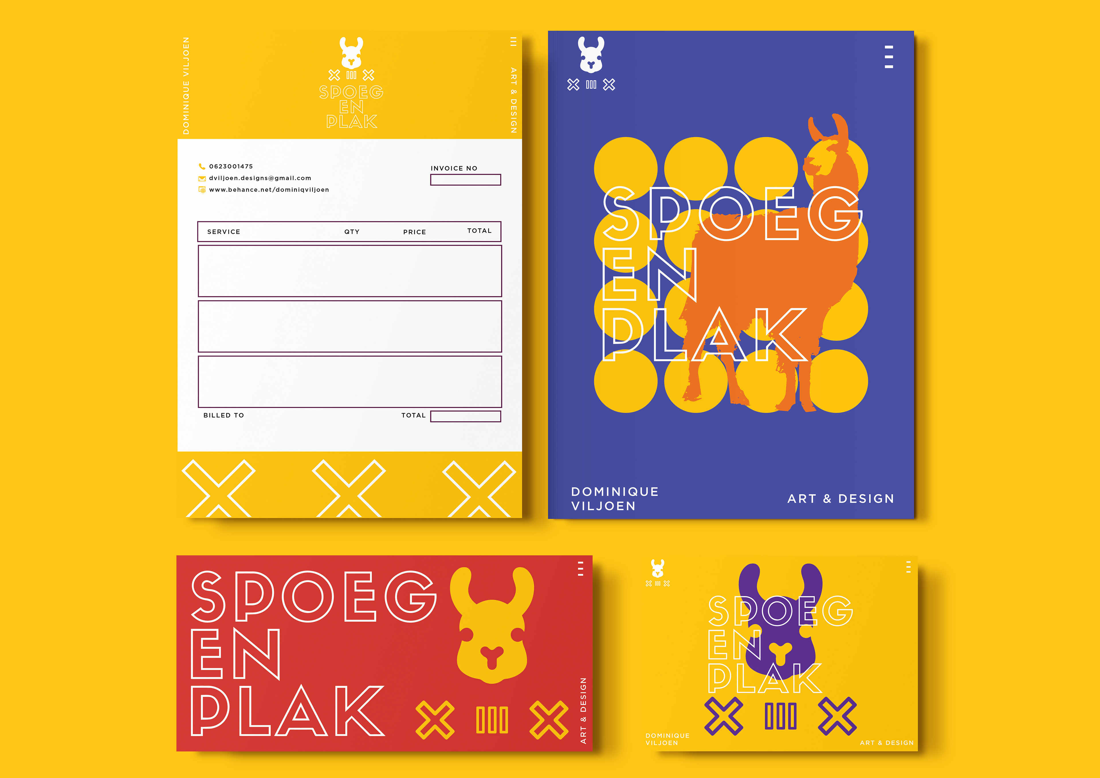
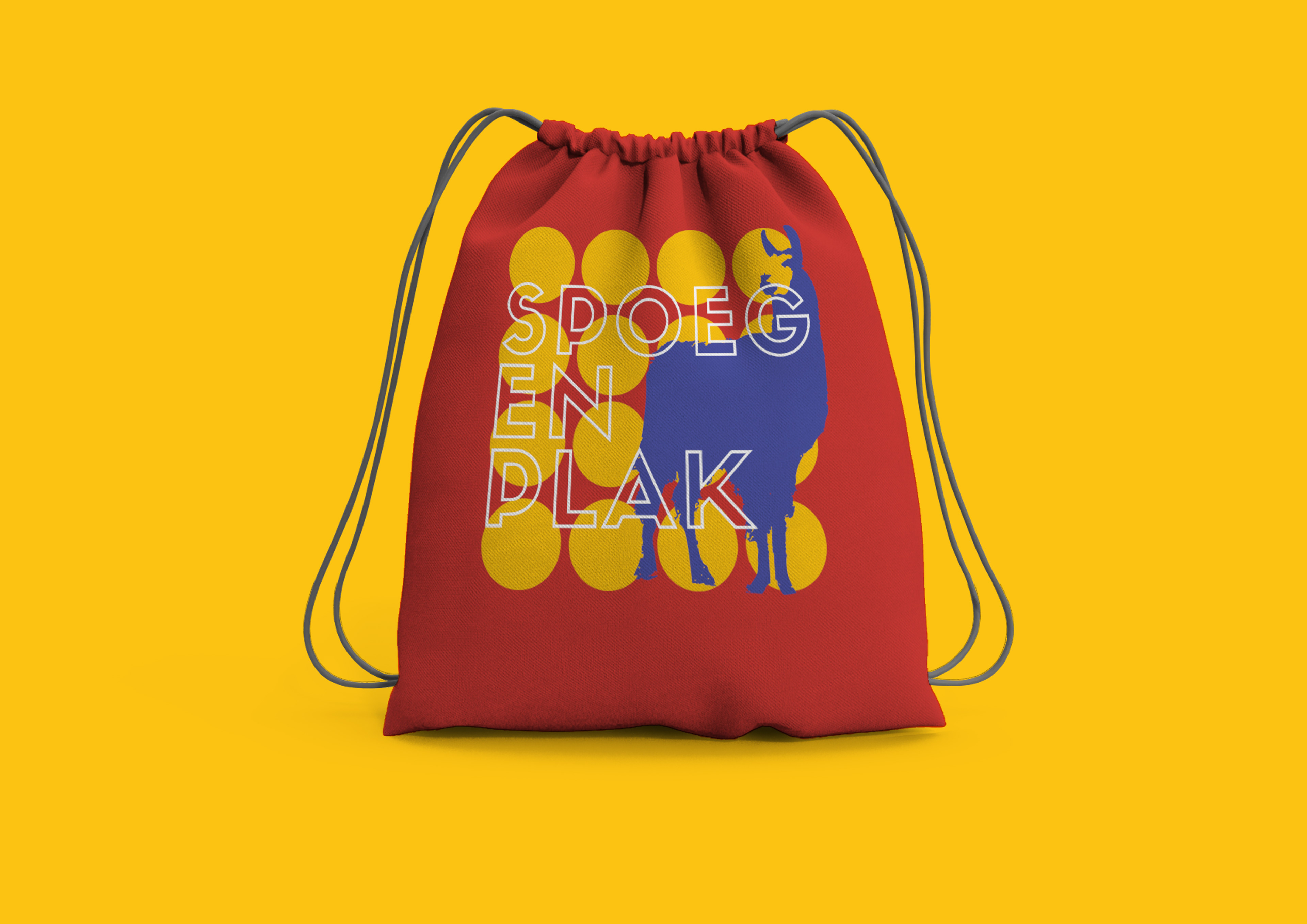
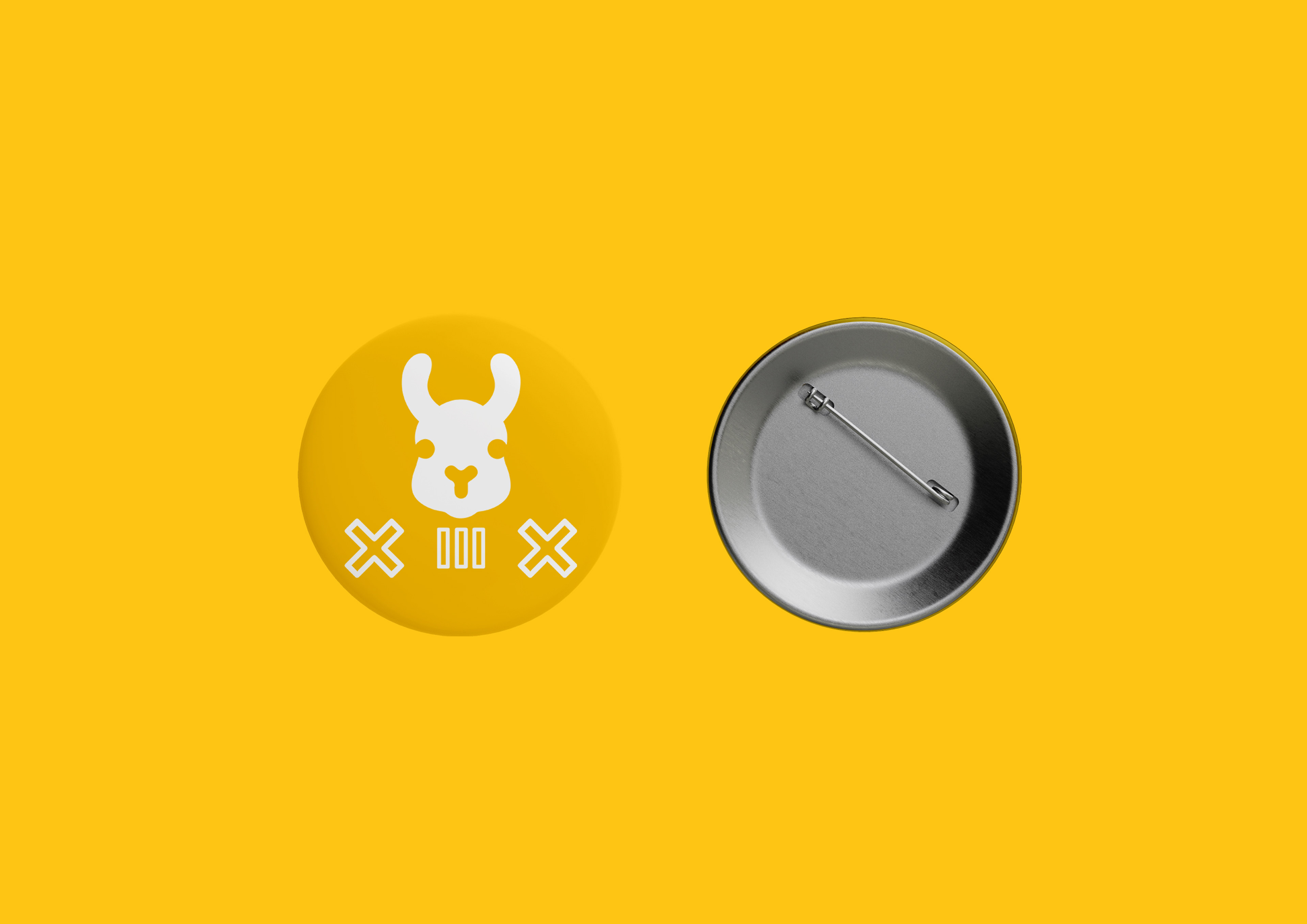
In keeping with my witty sense of humour I decided to use the Llama as my logomark as they are rather notorious for spitting on innocent bystanders.
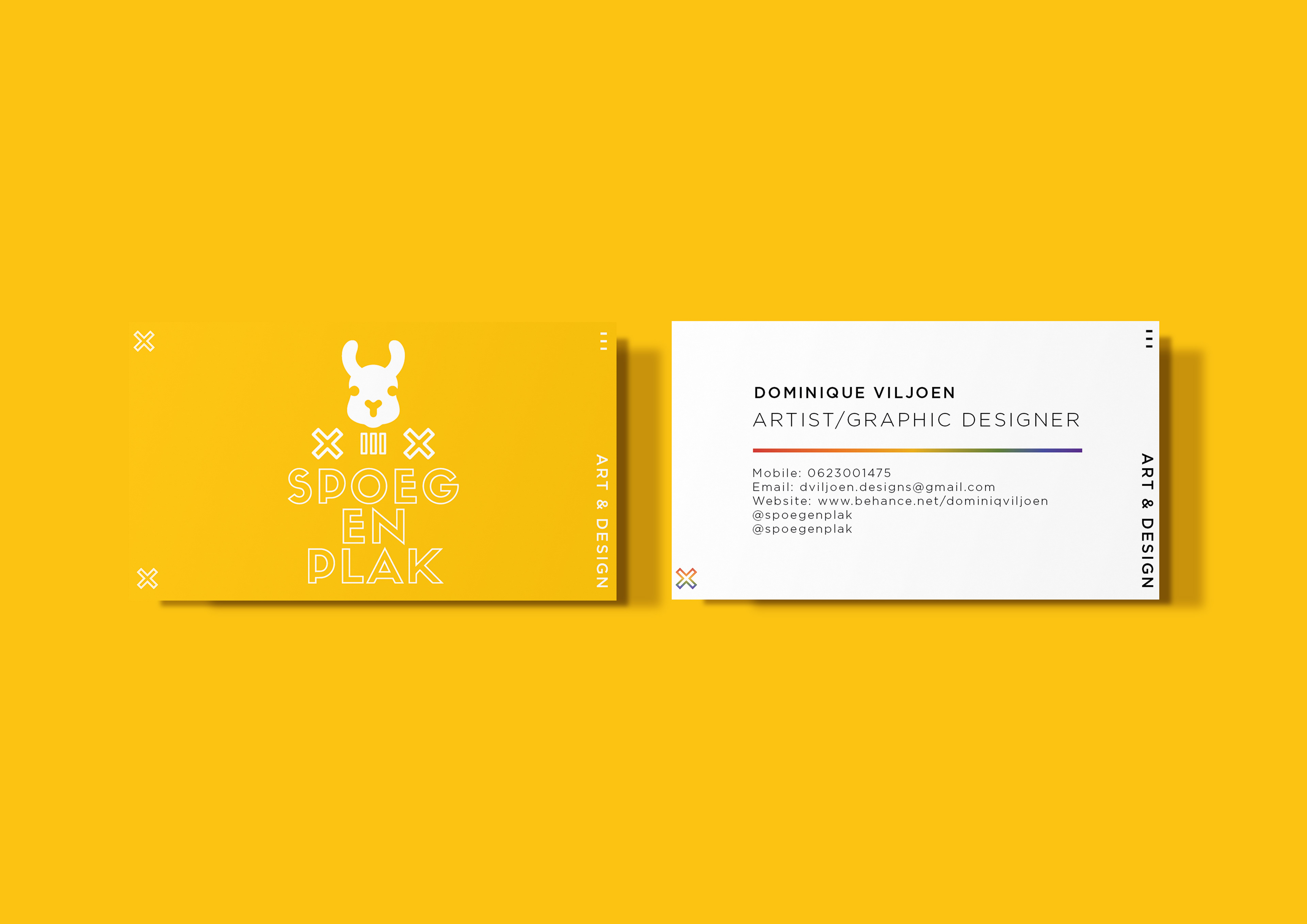
The visual direction of this project was greatly inspired by colour. The bold aesthetics used are a faultless representation of my vibrant, energetic and fearless design style.