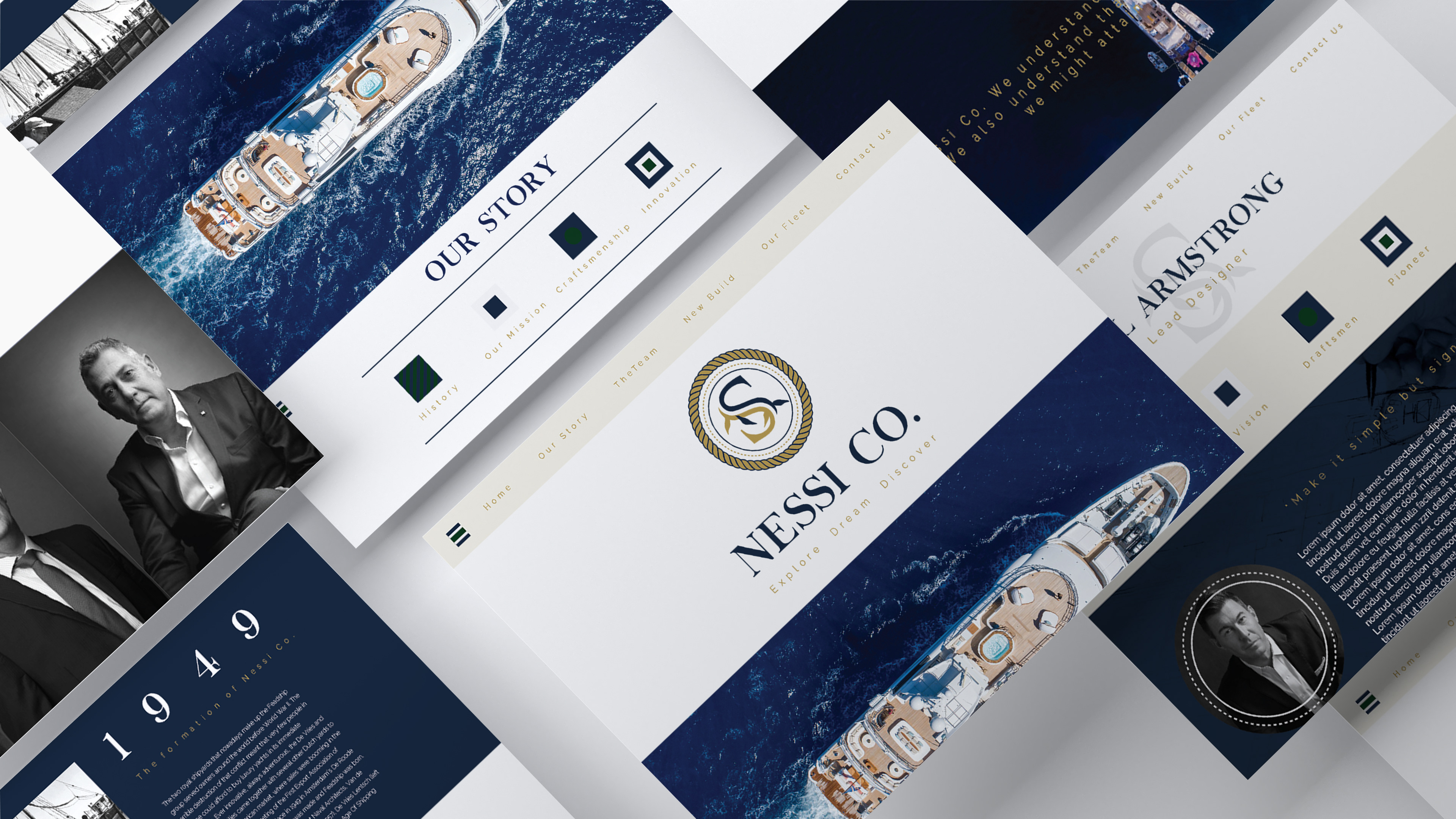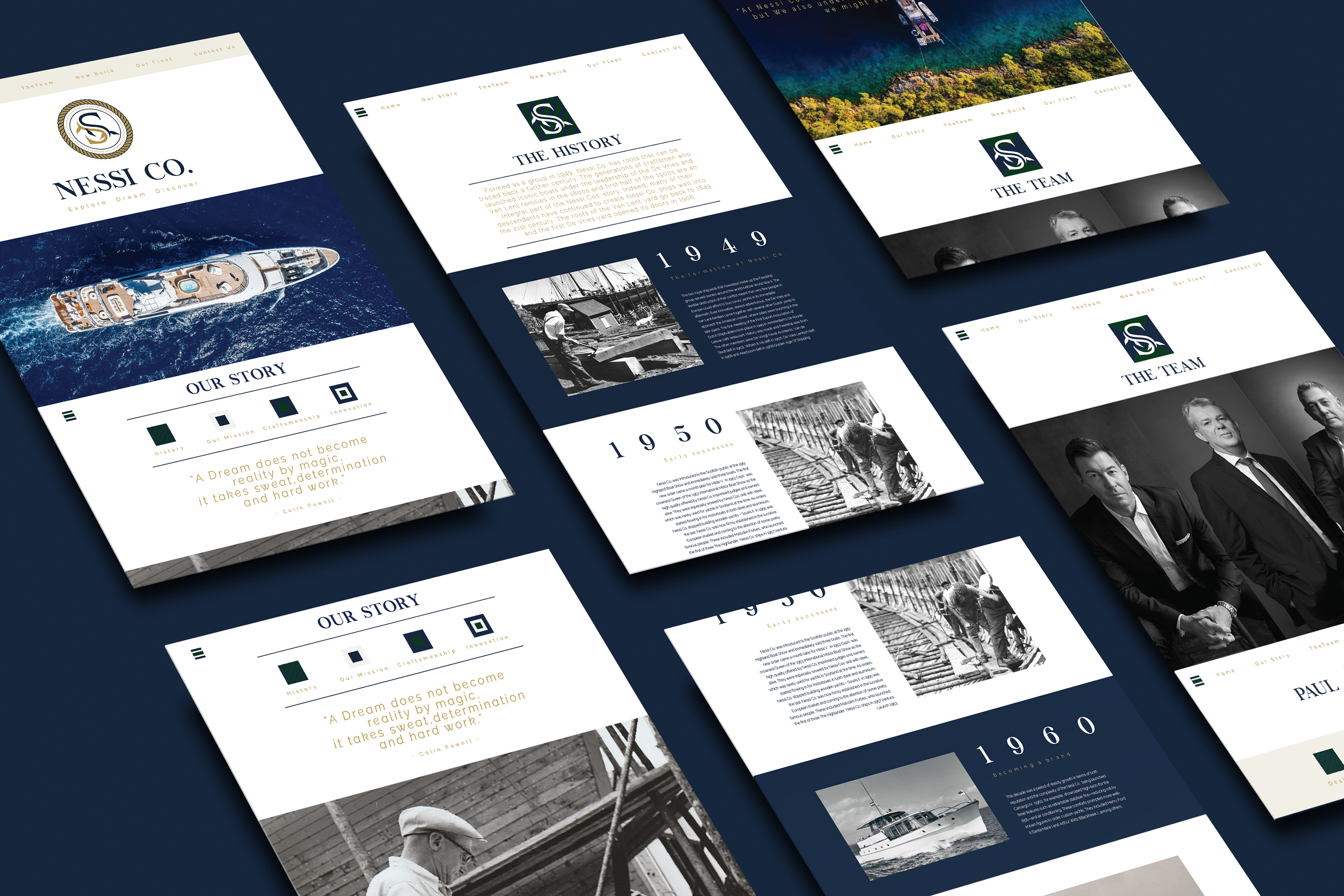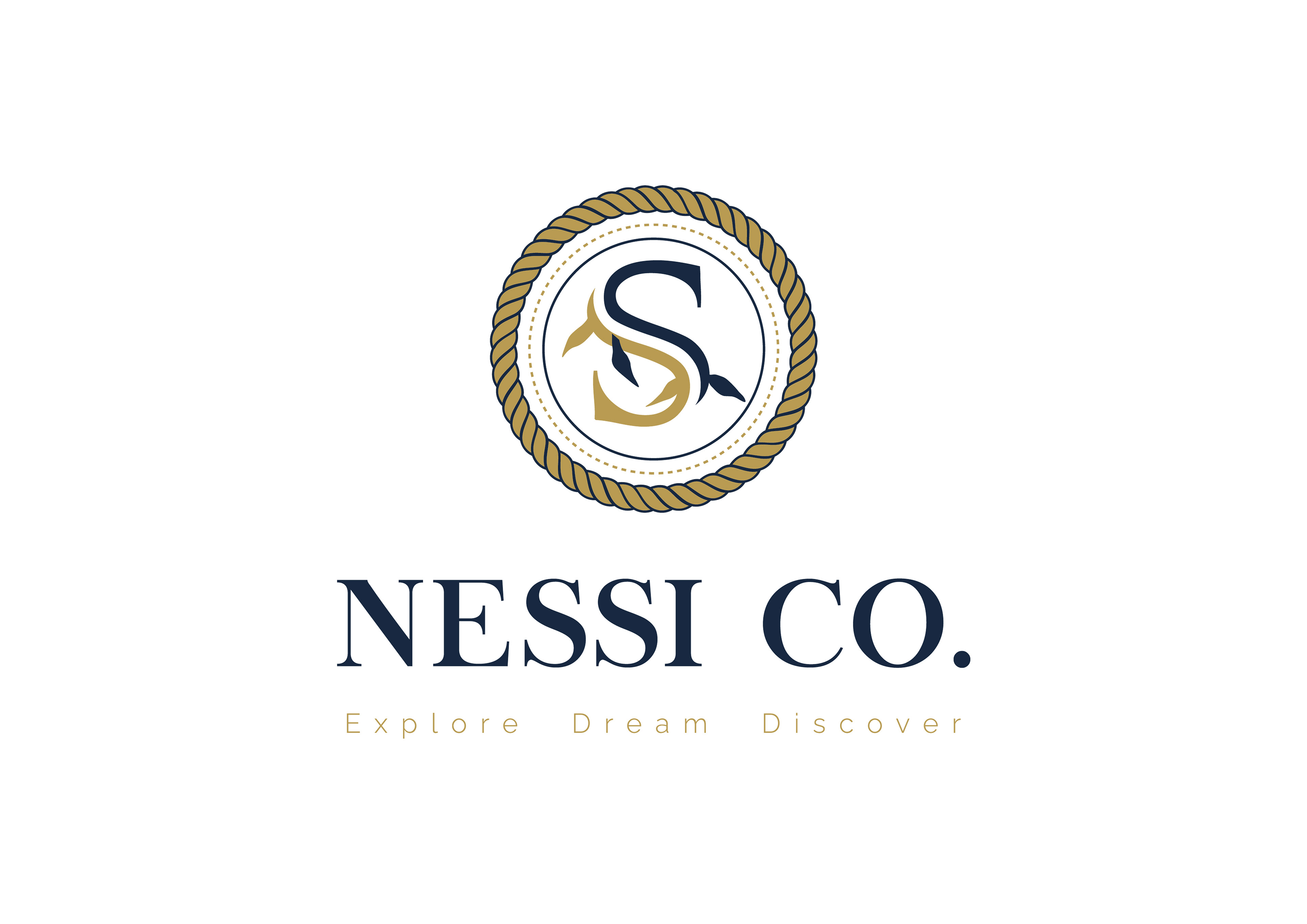
Nessi Co. was a practice, passion project. Brief box provides sample briefs from which designers can work. So although the client is fictional, the attention to detail in this project is a reflection of a standard fit for clients in the real world.
The Brief called for the creation of a corporate identity, as well as website layout which would successfully communicate the right brand style for a Luxury Yacht Building company called Nessi Co. based in Scotland.
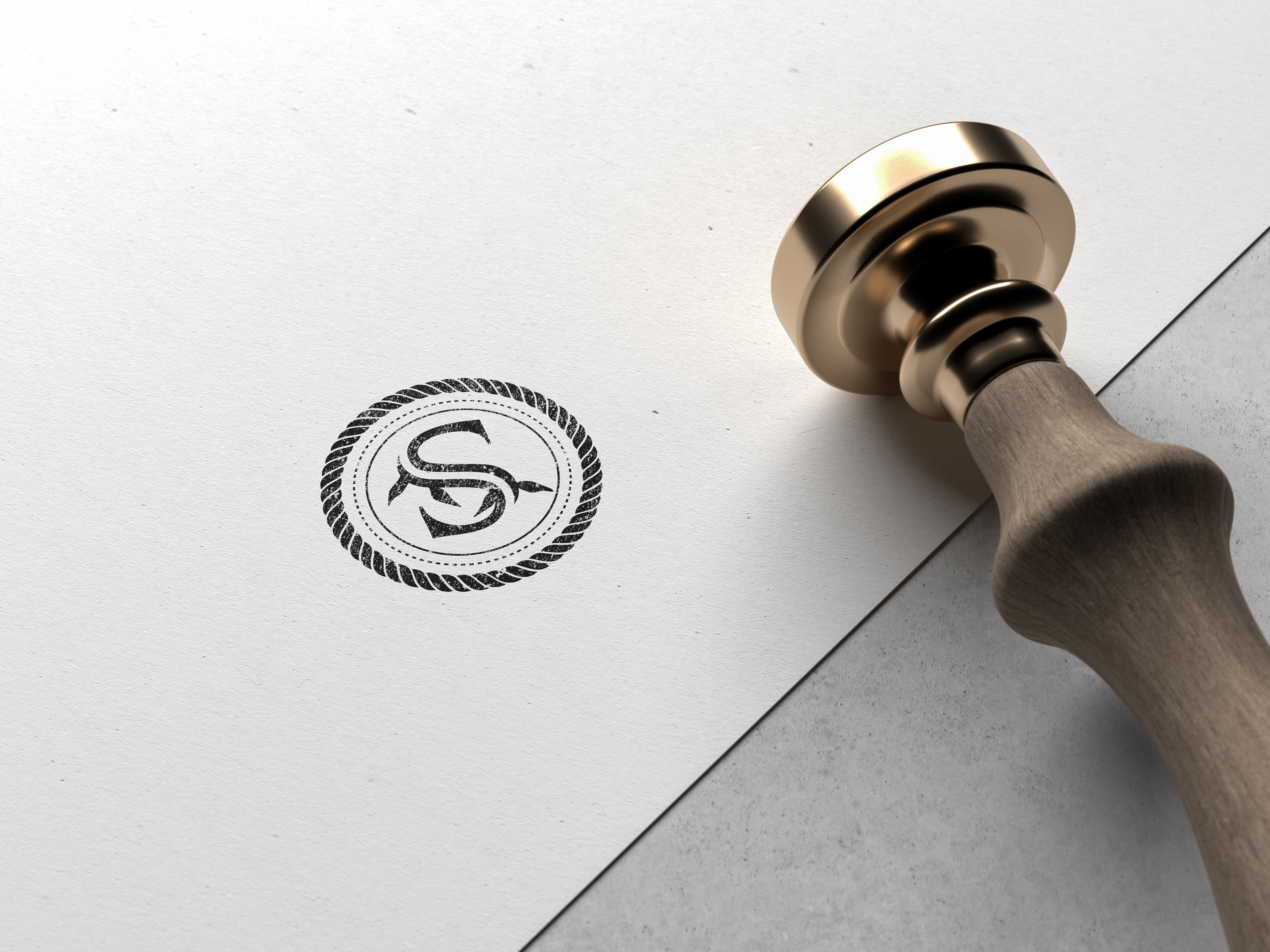
Being a Scottish yacht company with a name like "Nessi"- I could only conclude that "Nessi Co" derives from the nickname that Scottish locals have given to the famed mythical creature, 'The Loch Ness Monster'.
The logo itself emulates the most poignant aspects of the company itself. Being that the intended clientele was upmarket, the brief called for elegant and regal in it's design.
Firstly, I illustrated a Loch Ness monster using the letter 'S' set in the typeface 'Chapaza regular' for the Logomark. The addition of a roped border further references a maritime influence. The Logomark and Wordmark used typefaces similar to those found in Old maritime maps of the region. The combination of the Serif typeface set in a crest design is also a nod to the rich history of Scotland and it's seafaring nation.
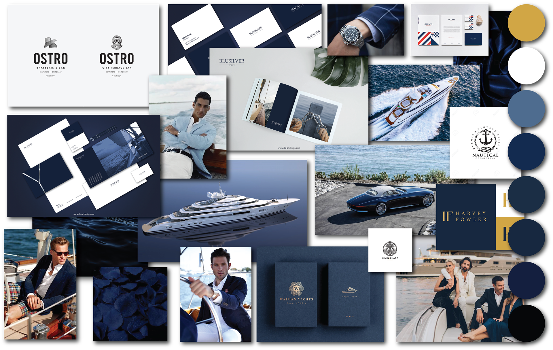
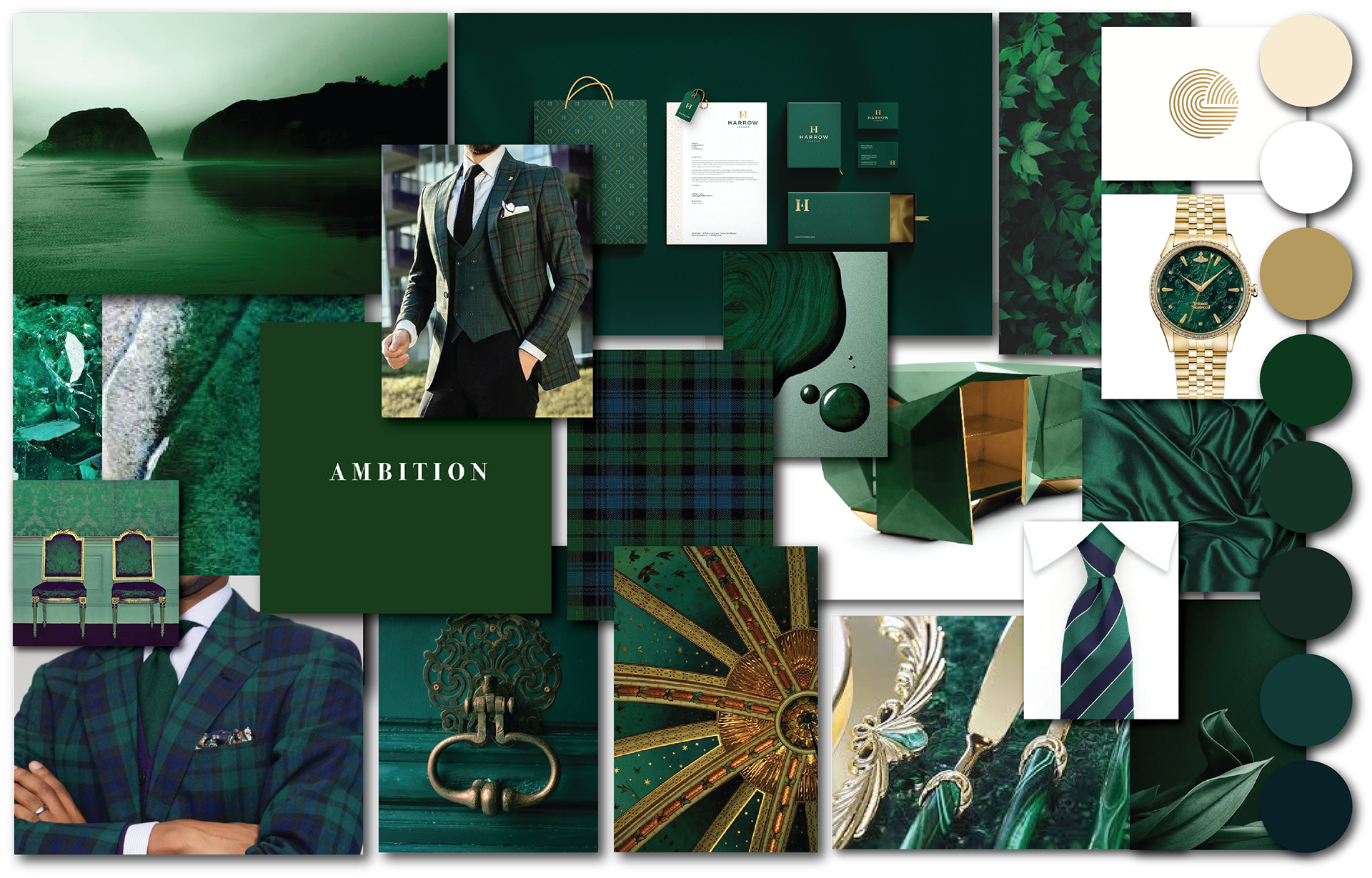
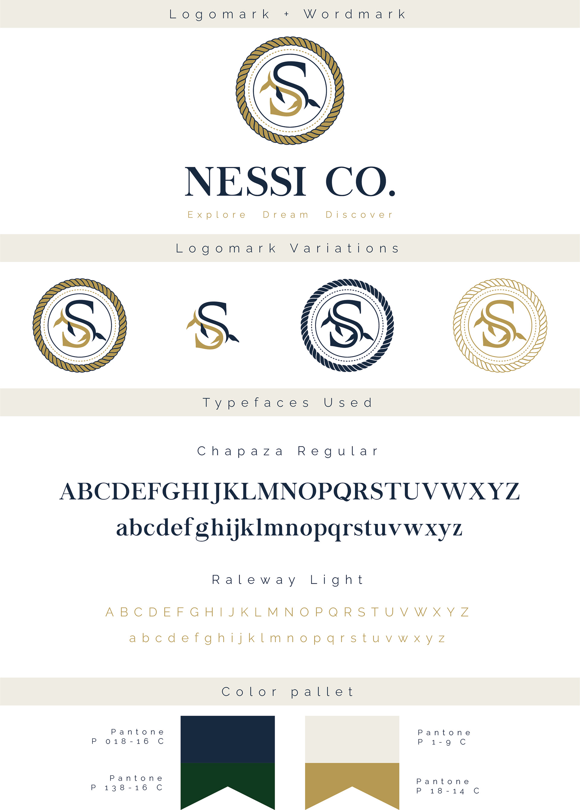
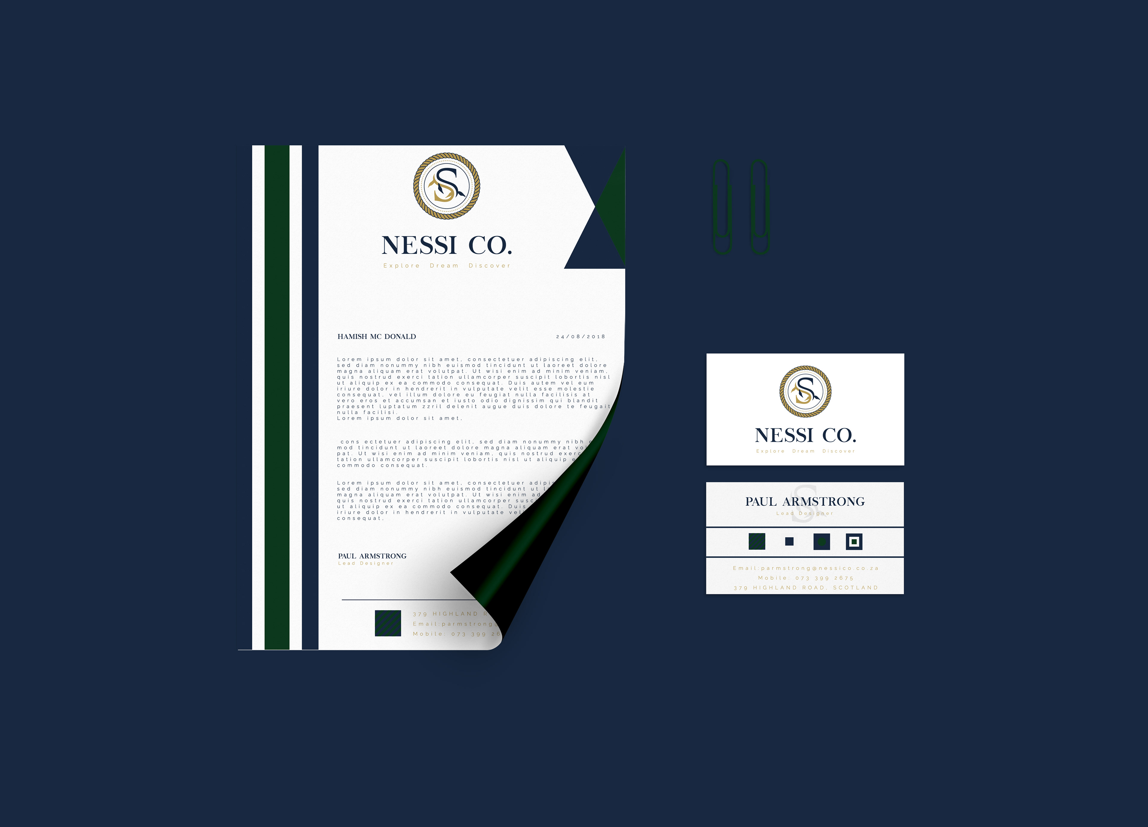
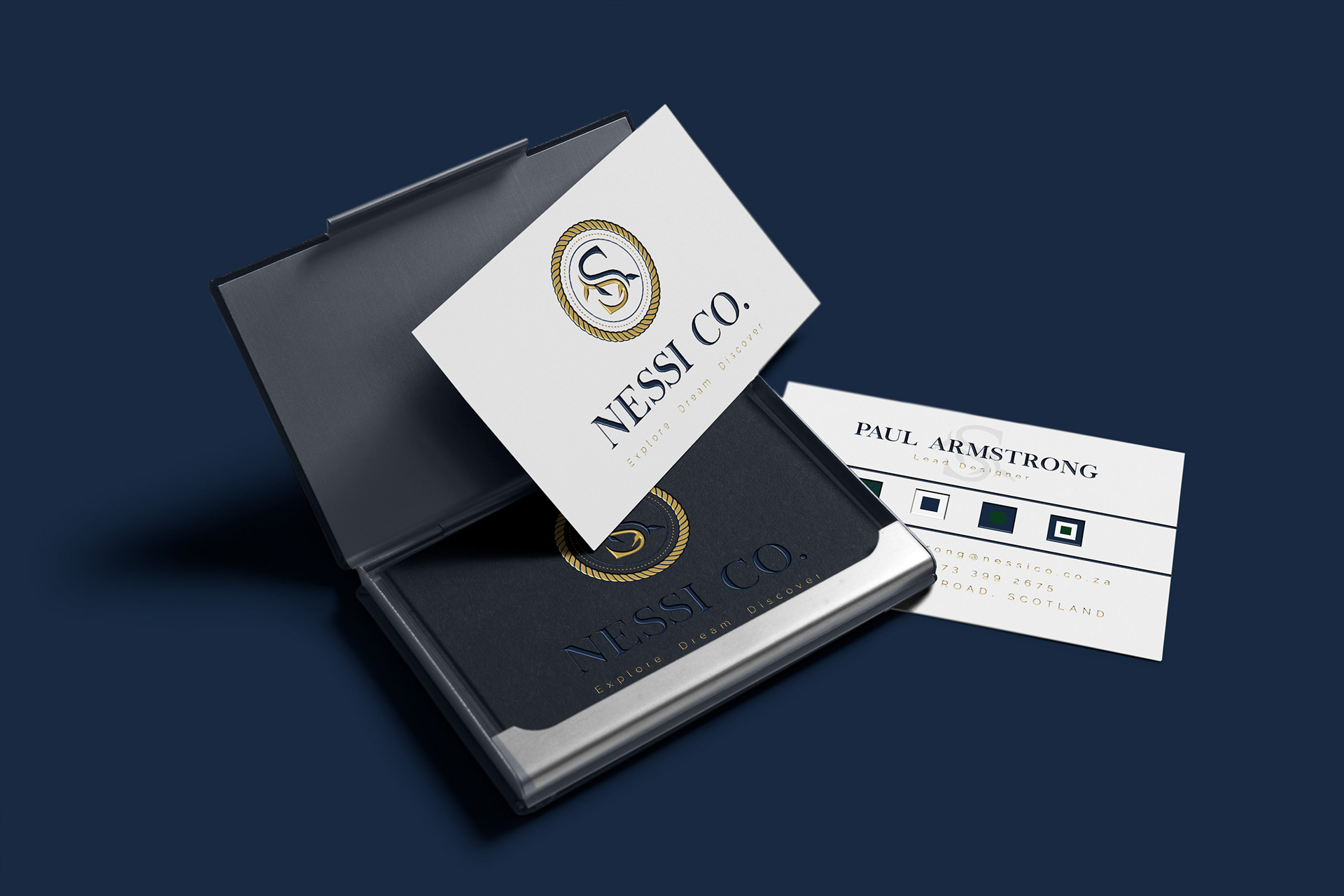
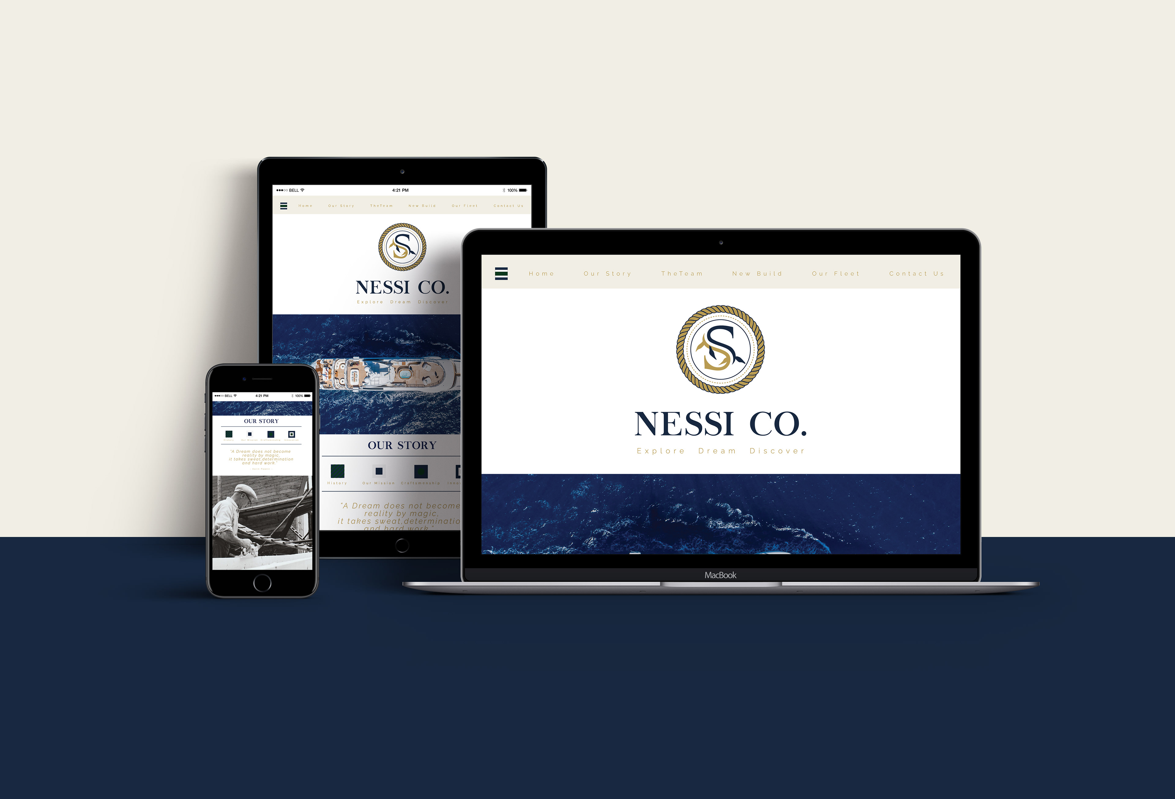
I used nautical flags as my buttons and icons and just changed their colors to match my chosen theme colours, dark Navy blue and Royal green.